This project used a combination of Sound Transit’s ORCA data (by way of TRAC) and Geoff Boeing’s OSMnx package for Python to estimate the explanatory variables of transferring from bus to the Link Light Rail network. Likely walking routes mapped iteratively by OSMnx collected data on distance, elevation, and vehicular characteristics of the adjoining street network to offer built and physical environment variables in the model. These walking route characteristics were supplemented by 3 groups of control variables, tested iteratively: station-area street network, origin line ridership, and link station ridership. The street network variables were collected using OSMnx, while the ridership variables came by way of TRAC’s station-level ORCA data. The full written thesis and all accompanying visuals and tables can be found here.
Analyzing ORCA Smartcard Transfers to Link Light Rail

Transfer Origin Heatmap
The Transfer Origin Heatmap above displays which lines feed into each Light Rail station most frequently. Some patterns emerge as some stations feature similar lines (e.g., Westlake and University Street) while others are relatively unique, such as Angle Lake. The heatmap was made using R’s ggplot package.
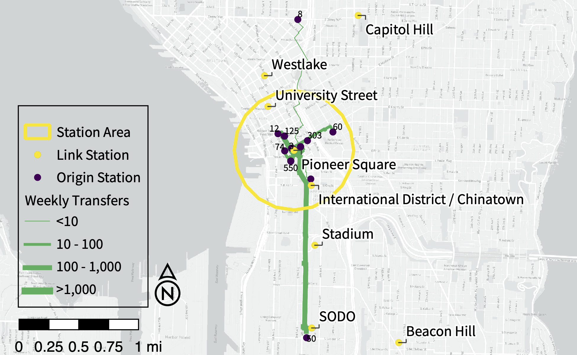
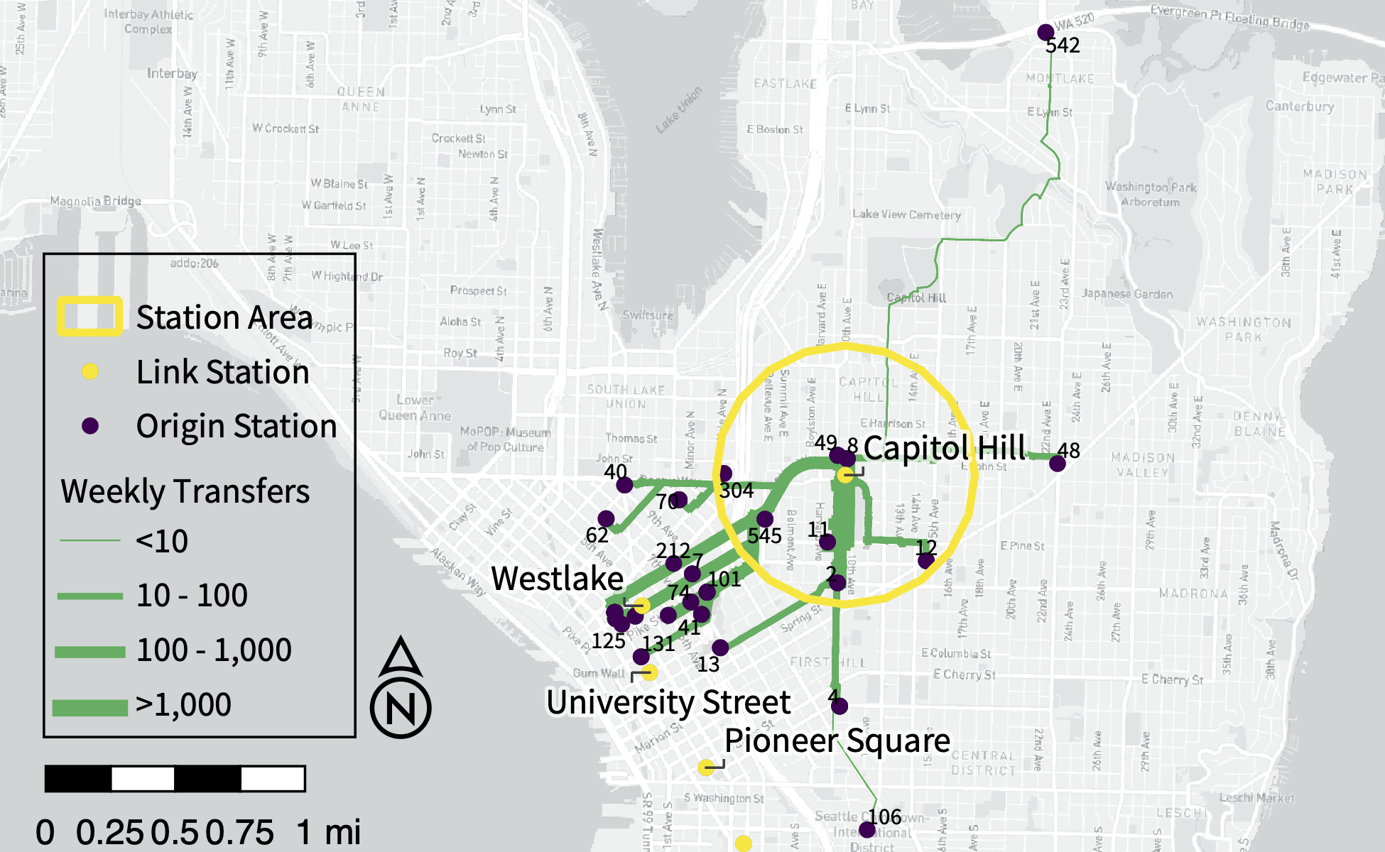
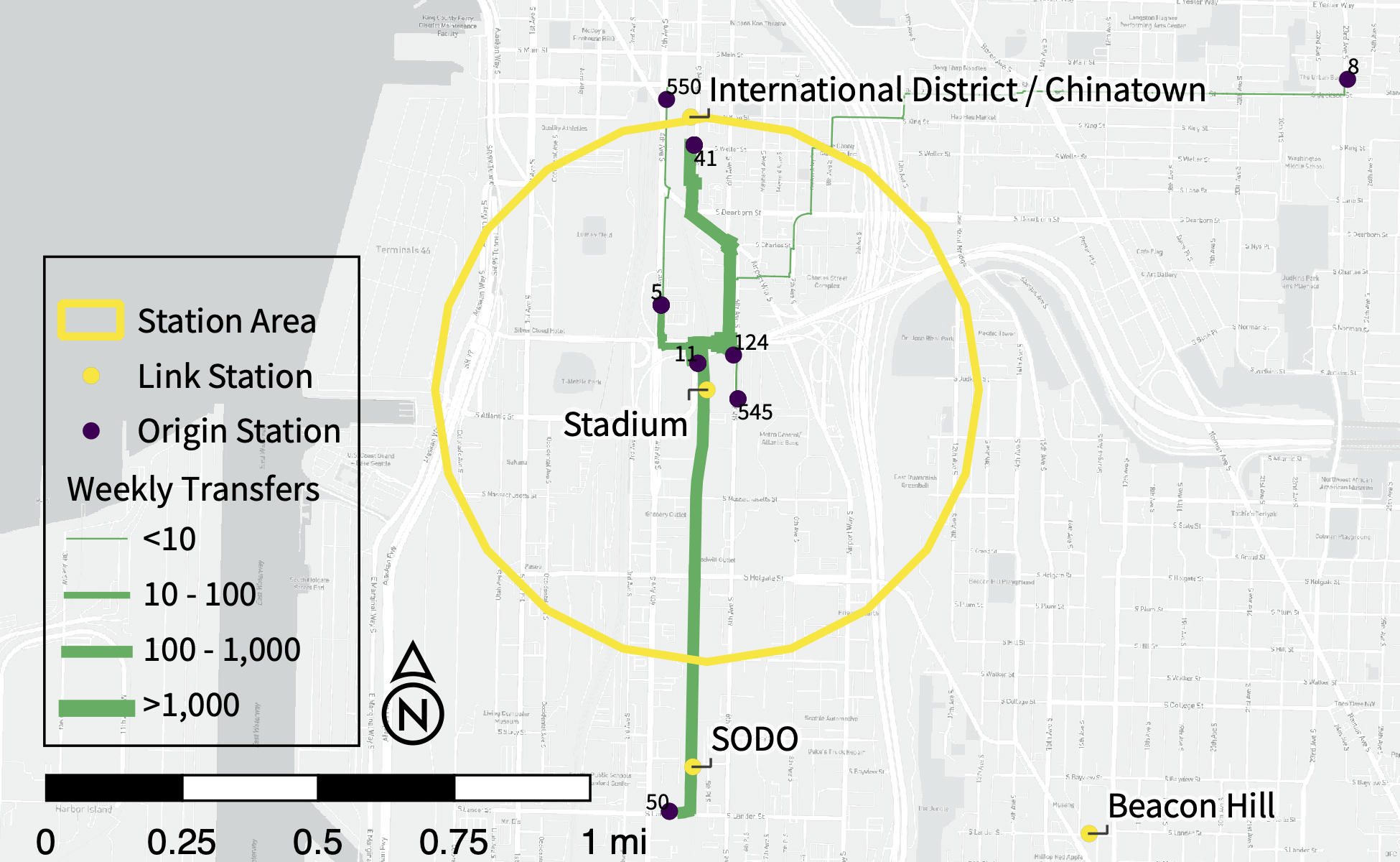
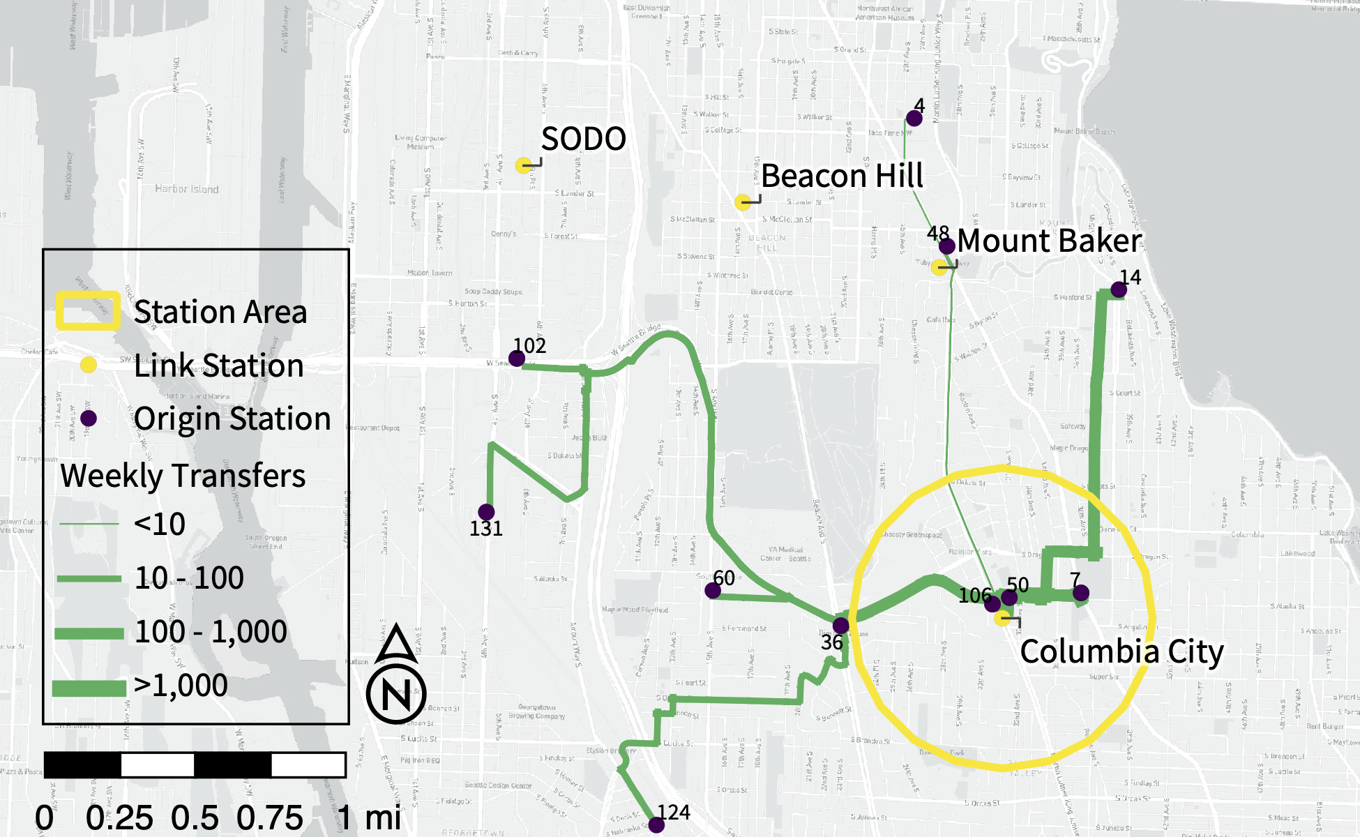
Routing Transfer Walks
The gallery below displays the shortest walking paths between each transfer within 1.5 miles of each Link station. Scroll through and notice how some origins are clearly nearer other Link stations or located in unlikely areas. Some of these might be “financial transfers” – where the rider was able to tap their ORCA card within the 2-hour window for the ride to register as a transfer but used a different mode in between the bus and light rail rides. The data for these maps were all collected iteratively in Python using the geopandas and OSMnx packages, before using QGIS to visualize, edit, and export PDFs for final touch-ups in Adobe Illustrator.


Diminishing returns as station distance increases
The plot to the left shows the expected change in transfers from a given origin station when shifted 1 block (300 feet) closer to the Link. All other covariates are held at their means. When the origin station is already closer to the Link, the change in transfers is significantly greater than when the origin station is further away. This highlights the logarithmic relationship between distance and transfers quite clearly and also presents a wider confidence interval for closer stations than further ones. Simulations were calculated using R’s simcf package before visualization with tile.

ORCA User Type Effects
On the left, the marginal effects, 95% confidence intervals, and observed data for each of the ORCA user types’ effect on the model is plotted. The theory behind this analysis is twofold. First, low-income users (LIFT) are more likely to be transit-captive and this could force them onto more transfer-heavy routes. Second, other studies point towards age, health, and mobility as drivers of transfers. Using each ORCA user group’s proportional ridership of both the origin line and the destination Link station offers some insights into how those theories track on the Link.
First, youth users had the strongest effect, but also made up a larger proportion of transit ridership more frequently (although it should be noted that Adult users are the vast majority just about everywhere in the system). Second, there was also some effect from LIFT users, it was not nearly as strong as among youth. Senior and disabled users make up relatively small proportions of ORCA use and transit ridership and had statistically insignificant effects. I used the R package simcf to simulate these counterfacutals, and tile to visualize them.

Comparison of Model Approaches
The chart above compares 3 models: a fully-saturated model with a linear relationship between walking distance and transfer volumes (Lin in green), another full model with a logarithmic relationship between distance and transfers (Log in orange), and a log-distance model without station area or ridership controls (Simple in blue). Each plot shows the marginal effects for each of these 3 variables, with all other variables held at their means. Observed data is plotted on each axis with a point for each observation, scattered slightly for better separation. The results show a couple of key findings in the model-building process. First, the log-distance models fit the data more closely and offer more confident estimates – as exemplified by their confidence intervals. Second, when accounting for both a more accurate effect of distance on transfers and station area effects, vehicular speeds have a relatively limited effect on transfer ridership. This suggests that some of the perceived safety and comfort of transferring are captured by the walking network in each station area.

Comparing Model Geographies
To account for any possible bias towards any given Link station, the model was run with different selections of stations. TRAC suggested that UW station can often distort results, so I began there, and continued by running the model with just downtown transit tunnel stations, then adding the rest of downtown Seattle’s stations, and finally adding all stations within Seattle’s municipal boundaries.
The results in the figure to the right suggest general agreement despite the different selections of stations. Statistically, none of the results from selected geographies are significantly different from the full model. Only the walking route characteristics are displayed here, but even among the station area and ridership controls, results were similar.